Clarity Conf 2024
A design systems conf with a point of view
Clarity Conf wrapped its 9th design systems conference at the end of September. Organized by Jina Anne (who’s been on the cutting edge of design systems work for over a decade), Clarity remains a conference with a clear (ha!) point of view that leans toward:
- community, inclusivity, collaboration, and accessibility in all things
- cross-functional and diverse skill sets that prevent silos and let people shine
- outside-the-box thinking to “close gaps (rather than simply bridging them)”
- a focus on people—design systems as a way of thinking and working, rather than tidy style guides or UI kits delivered in isolation
I attended Clarity for the first time in 2020 during the height of COVID shutdown, when many conferences scrambled to shift events from in-person to online-only. I was delighted by Clarity’s approach—emcees on the video stream, prize drawings based on participation in the chat, and an icebreaker video chat activity that randomly paired you with other attendees and a set of silly questions, speed-dating style. The emphasis on community and connection was palpable, even as we all sat in our own homes during the global shutdown.
An inclusive experience for attendees
As a design nerd who loves systems thinking I was excited to attend this year, which happened to be online again. Once again, Clarity’s point of view deeply resonated, with a steadfast and renewed focus on the impact of inclusivity. Even though the current economic environment has:
- tech workers navigating major layoffs with companies’ focus on investor returns
- a swing back toward favoring toward generalists
- efficiency and cost-cutting at the expense of quality or inclusion
- and a common denominator of AI pursued without careful intention …Clarity centered one of its recurring themes: “Design systems are for people.”
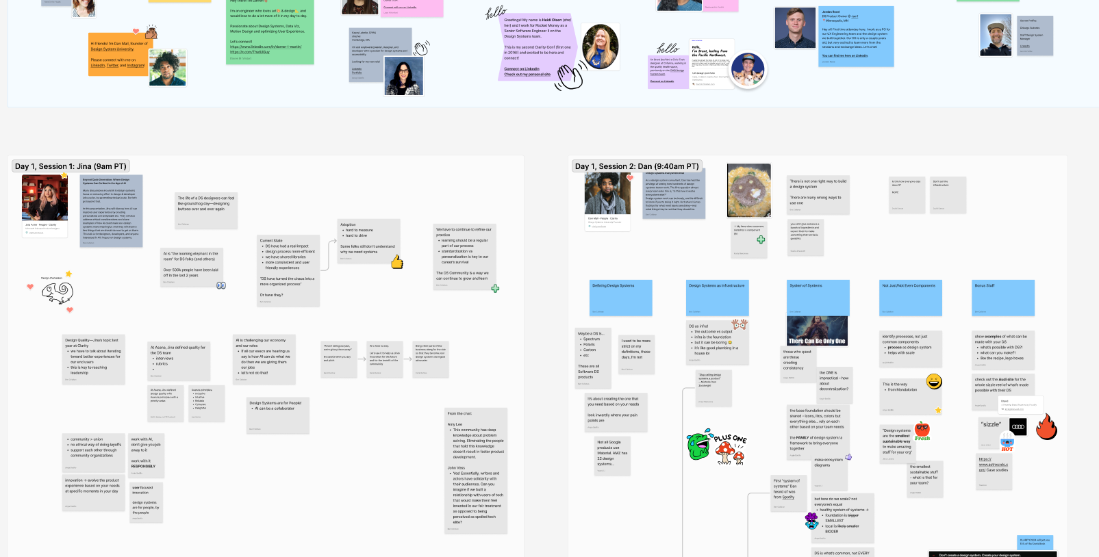
The focus on inclusivity came through in the experience Clarity cultivated for attendees. I loved the lively chat stream and collaborative notes in a shared FigJam board.

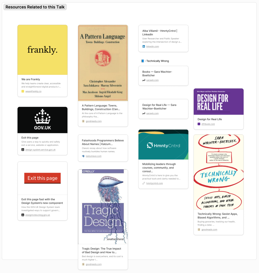
Below sections of notes for each talk, attendees shared resources and book recommendations from speakers:

All the talks and recommendations made my nerdy book-lover heart go pitter patter, and led to quite the reading list.
The talks
Every single talk was inspiring. Even in the weeks that have passed since, I feel energized and renewed in my commitment to design systems and systems thinking.
“Beyond Code Generation: Where Design Systems Can Go Next In the Age of AI” by Jina Anne
Key takeaways:
- As designers, it’s up to us to frame what we find useful about using AI with design. If we’re not talking about it with our colleagues, we’re not being proactive about the work we want to keep doing.
- What if AI wasn’t a designer’s replacement, but a collaborator?
- What if AI used design systems as guides to morph and adapt UI to a user’s environment?
In Jina’s keynote, she emphasizes that designers need to have serious conversations about AI. We should share our perspectives—particularly around generative AI—with coworkers and leadership. If we aren’t framing the conversation around when AI is and isn’t useful, we’re not being proactive about defining what work we want to keep doing vs. what we’re comfortable surrendering to AI.
Instead of generative AI that spits out tired or derivative UI design, Jina proposes that AI could address things like UI designs that adapt to your situation to make an app easier to use. If your device can sense your environment—that it’s dark, raining, and you’re on a noisy train—or that you’re right-handed and you have arthritis, how can its design adapt? How could a design respond to your unique needs and environment?
As designers, we should insist on AI not as our replacement but as a collaborator. We can use AI to understand what users want and need, and to personalize experiences. We still have a duty as humans to check for problems or biases and proactively fix them to do right by our users. Anything else is irresponsible.
“Design Systems Everywhere Else” by Dan Mall
Key takeaways:
- With the prevalence of design systems today, what people mean when they say “design system” can vary. Dan defines the 7 types of design systems in this video. Be clear with your team on which type you’re building.
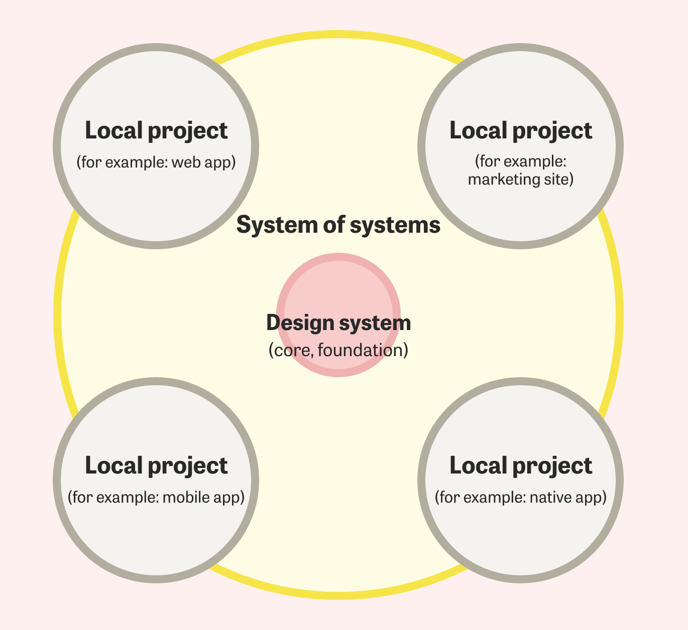
- Design systems shouldn’t aim to be large and all-encompassing, but can be powerful as systems of systems with a small core foundation. It’s okay for localized products that consume the design system to be larger and more complex than the design system itself.
- Sell the cake, not the flour and eggs. Be sure you showcase how your design system can be used and what it can build to help people see its power.
When you see him speak, it’s easy to see why Dan Mall is known for his work on design systems. He has a great collection of free resources and his Design Systems 101 course is packed with helpful insights and tips.
In his talk, Dan emphasizes how challenging it can be to define and agree on what a design system is. Getting clear with clients and collaborators on what we mean when we say “a design system” can reveal how much ideas differ from the outset. Better to align and clarify at the start.
We often look to systems like Shopify’s Polaris, Google’s Material Design, GitHub’s Primer, etc.—some of the few public-facing design systems—to define what a design system should look like or contain. But Dan encourages us not to worry about creating A Design System, but instead create your design system. Recreating Material Design might not be what your team needs. Look inward instead of outward and ask what your design system needs to be, what your pain points are.
Dan also points out that the allure of a Single Design System To Rule Them All is an easy trap to fall in. Instead, the ideal is a system of systems—interconnected systems that work together by respecting each other’s independence. A healthy system of systems architecture, when visualized, should reveal that local libraries are larger, and foundations are small. Rather than a large, cumbersome, challenging to support, slow to change Single Design System to Rule Them All, how can systems-within-a-system stay small and self-contained, but build on each other? How can design systems empower, decentralize, and build healthy ecosystems?

Design systems shouldn’t codify, consume, document, and control every single element of a digital product. Instead, they scaffold and supply just the commonalities, essentials, and tokens in a system’s genome that make easier and lighter work for product and platform teams. Dan shares Gall’s law:
“All complex systems that work evolved from simpler systems that worked. A complex system designed from scratch never works and cannot be made to work. You have to start over, beginning with a working simple system.”
Dan emphasizes that design systems should showcase what they can build. Lego doesn’t showcase individual bricks on their homepage; they show impressive, complete builds. People who want cake won’t be enticed when you try to sell them flour and eggs. Dan encouages us to sell them the cake.
“Queering Design Systems Thinking” by John Voss
Key takeaways:
- Queerness can teach us to embrace ambiguity—to see and imagine alternatives futures. In our design systems practice we can break norms and leave behind binary thinking that limits our creativity.
- A design system’s success is often measured by its scalability, efficiency, and adoption. But John emphasizes that “scale and efficiency are not human-centered measures of success,” and centering them risks losing sight of the real point of design: addressing human needs and serving people.
At a time when designers and engineers alike are questioning the future of our crafts amid mass layoffs and cost-cutting among design systems teams, John’s talk explores the possibilities queerness opens up for us. His talk was incredible, dense, and impactful.
After a crash course in queer theory, he asked us to consider what norms govern our work and why we privilege those norms over the alternatives. Queer theory looks at mainstream cis heteronormative culture and asks, “Why does this system require so much enforcement to maintain itself?” If design systems are built by encoding observable pre-existing UI and design patterns, our design systems are both an outcome and an act of social construction.
Determining the success of design systems by measuring adoption and usage allows us to seek institutional validation. But it also encourages us to constrain our work to prioritize business needs above human needs—one of the risks we need to be clear and mindful about when working in design systems. Scale and efficiency are not particularly human measures of success, and we risk confusing these measurements for the things they’re supposed to signify. We need to get more comfortable stating who and what we’re privileging in our design systems work and why.
The best design systems are built by observing and encoding what exists already, not creating a system from scratch to restrict and enforce. As makers of design systems, how can extend greater freedom and fluidity to products consuming the design system, rather than restricting and enforcing them in the name of consistency? Sometimes we encode unhelpful power dynamics into our design systems, even if it’s unintentional.
John shared so many insightful and reflective questions peppered through his talk, like:
- Can a model of conservancy replace efficiency? Can we validate we’re building the right things first?
- How can we allow more room for creativity in the system?
- Where is binary thinking limiting our creativity and design thinking?
- Who is on the other side of the boundary of our work?
- Who are we leaving behind?
- How can queerness help us challenge the status quo and encourage us to find alternatives that are more inclusive?
Conclusion
Clarity Conf 2024 was packed with thoughtful reflections and actionable insights. The experience left me with plenty to reflect on and a lot of excitement for continuing to invest in a design systems approach that centers people and positive impact. And these were only 3 of the 12 talks.
I’ll leave you with some of the resources shared by speakers and attendees, which I’ll be devouring in the coming months.
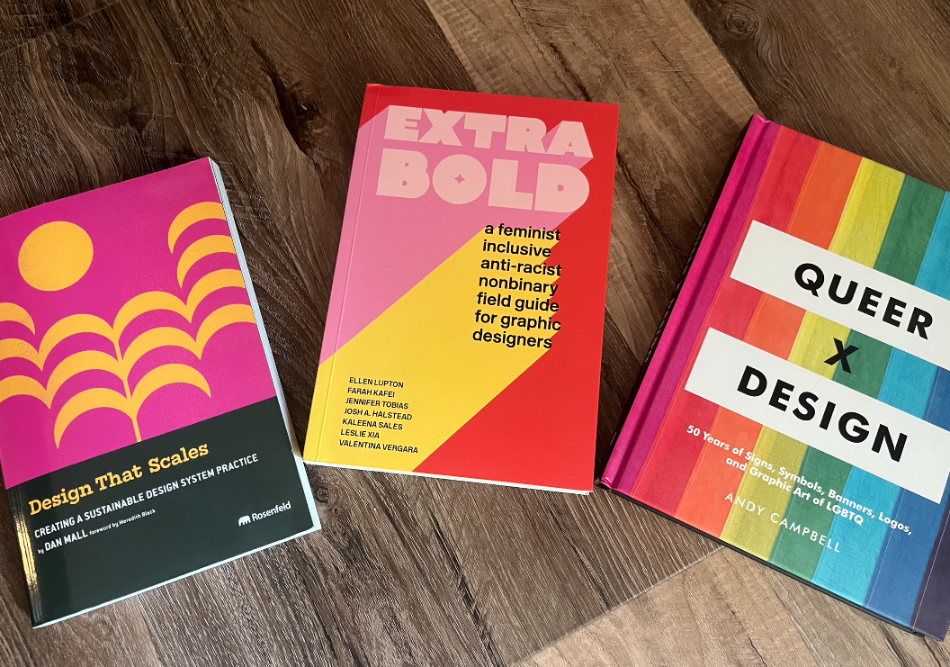
My book haul

Some of the titles I learned about at Clarity and have purchased to work my way through:
- Design That Scales: Creating a Sustainable Design System Practice by Dan Mall
- Queer X Design: 50 Years of Signs, Symbols, Banners, Logos and Graphic Art of LGBTQ by Andy Campbell
- Extra Bold: A Feminist, Inclusive, Anti-Racist, Nonbinary Field Guide for Graphic Designers by Ellen Lupton (Thinking with Type), Farah Kafei, Jennifer Tobias, Josh A. Halstead, Kaleena Sales, Leslie Xia, and Valentina Vergara
- Design Justice: Community-Led Practices to Build the Worlds We Need by Sasha Costanza-Chock
- Impact Players: How to Take the Lead, Play Bigger, and Multiply Your Impact by Liz Wiseman
- Black-and-White Thinking: The Burden of a Binary Brain in a Complex World by Kevin Dutton
More resources and reads
- Dan Mall’s 7 types of design systems video
- Design Systems 101 and other video courses from Dan Mall
- Queering Design Systems Thinking post by John Voss
- Queer Theory for Design, a list of resources from John Voss
- Reimagining Design Systems at Spotify
- Can I get an Encore? Spotify’s Design System, Three Years On
- Ship Faster by Building Design Systems Slower by Brad Frost
If you’re looking for a team to help you discover the right thing to build and help you build it, get in touch.
Published on October 25, 2024
