How We Built a Color System from the Ground Up
Next-level efficiency and scalability for color in design systems
Jumpstart provides a Ruby on Rails template that entrepreneurs can use to launch a product quickly. Common features like team accounts, social login, invitations, billing, payments, and multi-tenancy are built in and ready to use, saving their customers weeks of development time. Jumpstart asked Flagrant to help refresh their component library to provide customers more ability to customize components and UI elements with greater variation in layout and appearance.
When we partnered with Jumpstart, our goal was to create a design system that would enhance their tools and provide the flexibility needed for their users’ SaaS applications. We introduced a scalable, adaptable color system capable of supporting light and dark modes, numerous themes, and multiple brands, all with accessible color combinations that can be consistently applied.
By working closely with Jumpstart’s development team, we ensured that the design and color system we delivered not only matches the robustness of their code and templates, but also provides the customization their customers need to support rapid growth and innovation.
Understanding Design Tokens vs. Color Roles
Design tokens are the smallest, most atomic, repeated design decisions that make up a design system’s visual style. Design tokens store design decisions as raw, static values like hex codes, font names, and measurements.
A color token is a type of design token that maps an individual color to an associated value, such as #b91c1c. The color token replaces this static value with its atomic (more human-readable) name in a color ramp, like Red 700.
Color roles are reusable variables that apply color consistently across components and UI. Rather than atomic names like Red 200, color roles use semantic names like bg-primary and text-on-primary.
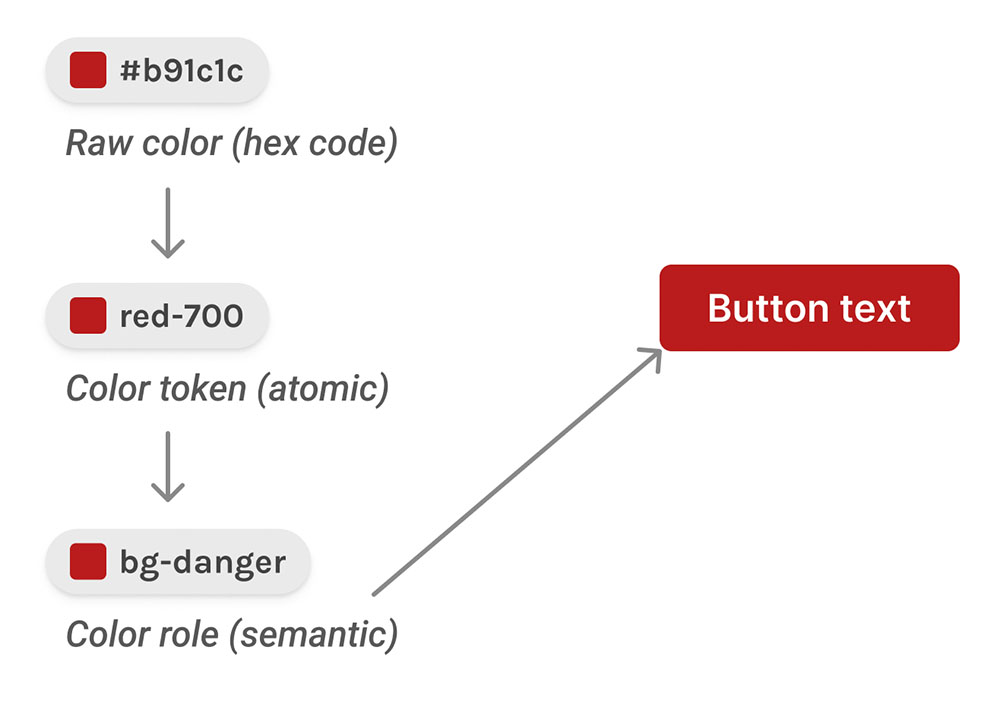
A semantically named color role doesn’t replace a color token. Instead, a color role refers to a color token allowing you to detach and change the color token associated with the color role if something changes.
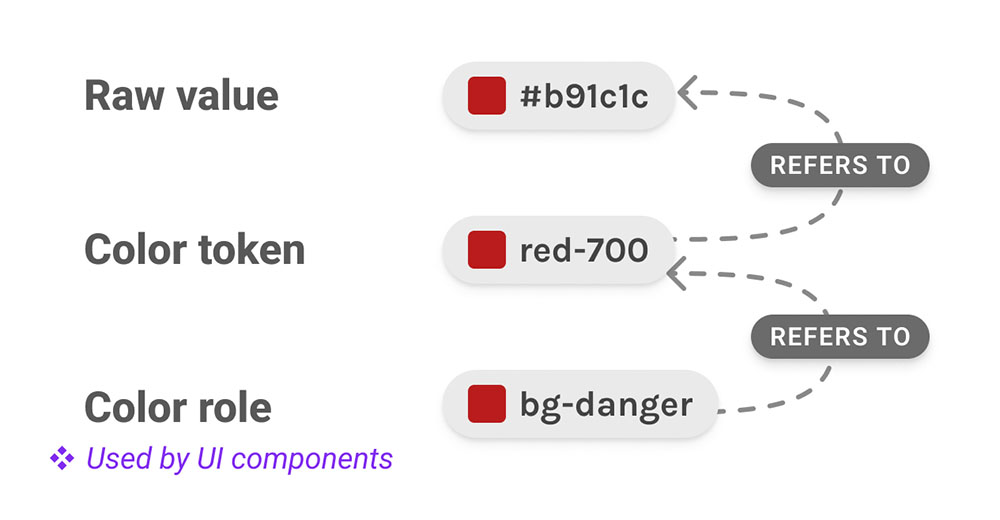
If design tokens are like atoms in Brad Frost’s conception of atomic design, color roles are more like molecules. Even though a color role ultimately still refers to a color token (which refers to a raw, static color like a hex code), its semantic name tells us a lot more about its place in the system.
Setting up a color system with semantic building blocks for naming
With semantically named color roles, it’s easier to select the right color for the job. We used a method for naming that captures the many facets that make up where/when/how a color gets used in designs. Think of these as the building blocks for a color’s name.
Once we applied color tokens to our designs, we looked to see which colors were reused across multiple components and created some categories to help derive semantic names for them:
- Type - The UI element a color is applied to.
- Role - The function communicated to the user (usually about a process or action) in a particular situation.
- Prominence - The emphasis or importance an element has. For example, a button for an important action should stand out the most on a page—it has “primary” prominence. In our color system, “primary” and “secondary” are used most for buttons and links, and correspond directly to the primary and secondary colors of Jumpstart’s brand.
- State - The status of a component or interactive element.
| Type | Role | Prominence | State |
|---|---|---|---|
| bg | danger | primary | hover |
| text | success | secondary | focus |
| icon | info | tertiary | selected |
| border | warning | accent | disabled |
| SPECIAL: base, on | |||
Not every combination of these building blocks will be needed in a given color system. Rather, once you have color tokens applied to some components, you can create a table like this to systematically derive semantic names that describe what a color does—its role in the larger system. For example, these are some of the semantic names we constructed using the table above for color roles in Jumpstart’s components:
text-danger- Used for text that communicates an error to the end userbg-primary- The primary brand color used for button backgroundsbg-primary-hover- The color the background on a primary button shifts to when hovered
When creating your own color system, you can add more building blocks that Jumpstart doesn’t use like: visited, active, assistive, inverse, brand. Other systems may have different or additional columns (for example, Asana’s color system uses “sentiment”, “usage”, “prominence” and “interaction”).
Look through your designs to see how colors are used—what role they fill across multiple designs in the system—and define the building blocks you need for your color names. Depending on what components or design system you’re working with, you may not be able to apply another color system’s approach to semantic naming blocks as-is.
Color combinations and accessibility
There were two special building blocks we needed for naming colors that didn’t fit cleanly into the other categories for semantic naming—base-* and on-*.
base indicates a baseline or default foundational design element like page background, divider lines, borders on elements with focus, etc. As a semantic building block base was especially important for colors we used to portray elevation, like base-bg-lowest and base-bg-highest—especially in dark mode, where things like drop shadow can’t be relied on to communicate depth. We also used base to set consistent colors for things like icons (base-icon) and text (base-text, base-text-disabled, etc.).
Semantic names with on-* capture a relationship to another color in the system—a color for use on top of a paired color (which can be identified by the same building blocks in its semantic name). For example, text-on-danger-secondary is used for text that appears on a bg-danger-secondary fill color.
A color role’s semantic name gives clues about how a color may “bond” with other colors to combine into a more complex molecule—a UI component. Named pairs that use on-* are especially useful for accessibility. Once we’ve checked our contrast ratios for a particular pair, we can use them anywhere with confidence that we’re meeting accessibility requirements for color.
Putting it together: consistency and re-use
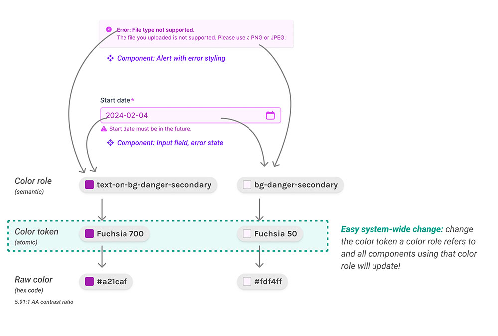
Let’s look at an example of how color roles and their names communicate how colors work together across multiple components. For Jumpstart’s input field component, the error state uses the color roles bg-danger-secondary and text-on-bg-danger-secondary:
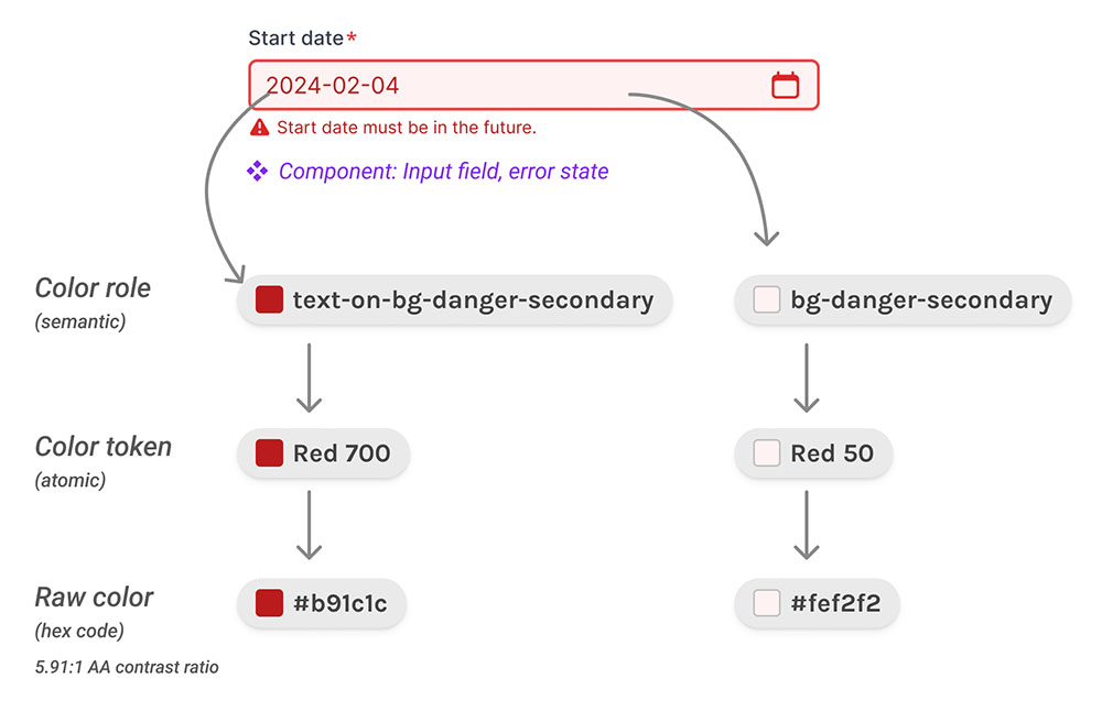
With semantic names, it’s easy to recall and reuse this same color combination, regardless of which component or context we’re designing for within the larger system.
We can apply the same accessible, semantic color combination to a different component: alerts, which also use bg-danger-secondary as a background color for an error alert with text-on-bg-danger-secondary as a text color:
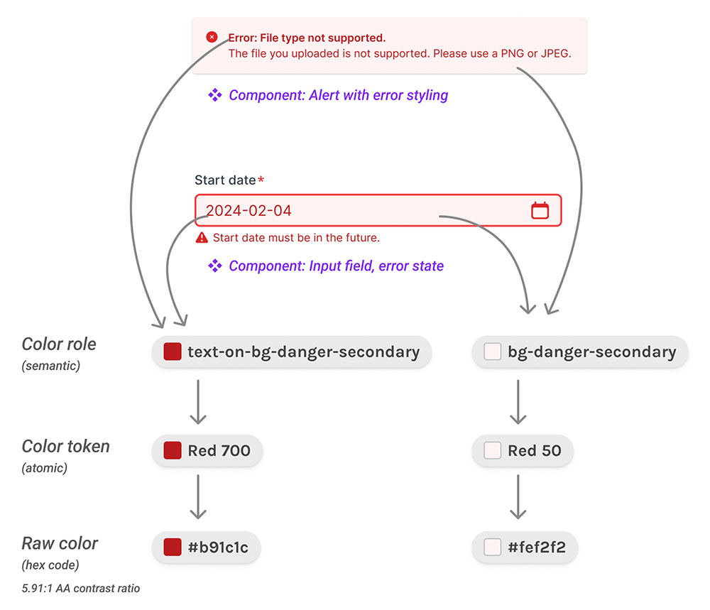
This aspect of a color system is especially useful if, like me, your goldfish brain kicks in around 3pm every day and you can no longer hold color values and combos in your head while flipping between files. Or when you walk away from a project and return to it months later.
Flexibility and scalability for easy system-wide color changes
But what if we want to use something besides red for our danger color palette—something different to go with a particular brand palette we’re working with? This is where the scalability and power of the color system really shines.
Instead of having to find every component that uses a color combination of Red 50 and Red 700 to manually recolor to fuchsia, we can make the change for this combo in a single location, remapping bg-danger-secondary and text-on-bg-danger-secondary to the new colors Fuchsia 50 and Fuchsia 700. When a color role is assigned a new color token, any components that use it dynamically change color system-wide, saving huge amounts of time.
The color system allowed us to design and add themes to Jumpstart efficiently. Without a color system, we would have had to manually recolor every component design separately for light mode, dark mode, and for any themes offered—n themes = n times the work. That’s simply not sustainable. Instead of manually applying color changes in hundreds of places across dozens of components, changes within a color system ripple out dynamically system-wide wherever color roles are used by components.
Conclusion
With a color system, it’s easier and more efficient to theme, customize, and make system-wide changes to color. By creating semantic color roles for use by components within a design system, a color system makes it easier to maintain consistency at scale.
Design systems and the use of design tokens have been a staple of our work with clients with products that need to scale, but the addition of a color system was crucial to support light and dark modes, multi-theming, and multi-branding—all with the flexibility and customization Jumpstart’s customers expect.
Through close partnership with Jumpstart’s development team, we were able to create design resources and tools to match their robust offerings of code and templates for SaaS products. Now they’ll be able to maintain and enhance their product and components efficiently to meet customer needs and stay competitive—not just on the development side, but with UI design too.
Additional resources
- How to Define Color Usage Through Semantic Sets for Design Systems by Katie Cooper
- Color in Design Systems: 16 Tips for Setting Up a System That Endures by Nathan Curtis
- The Walrus 2.0 Design Token Strategy by Lenora Porter
- Material Design: Design Tokens & Material Design: Color System
If you’re looking for a team to help you discover the right thing to build and help you build it, get in touch.
Published on September 12, 2024