Case Study / Jute Pages
Exploring Jute pages: A Case Study
Client Context
A lot of work, time, and — yes — money goes into building a website, but for small business owners, there are far too many benefits to ignore having an online presence. From driving your business’ success through searchability to curating and maintaining control over how the business is perceived by customers, it is nearly impossible to operate a successful enterprise without a website. Unfortunately for many small business owners, the necessary expenditure of the aforementioned resources is simply not practical. This is where Jute comes in.
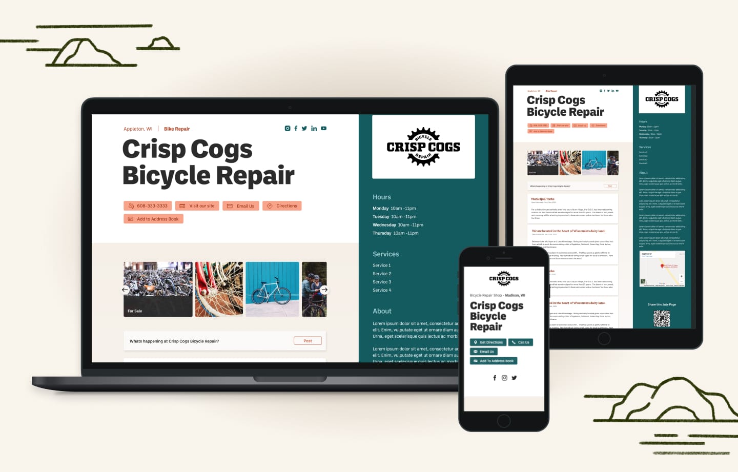
Jute Pages, born in 2021, is a website building platform that hopes to alleviate the burden of creating a simple-yet-beautiful website for companies that require an online presence but lack the time, money, or skill-set required to create one on their own. Like any greenfield software product, a totally new software environment requires development from a clean slate and, therefore, getting it off the ground was no easy task. That’s why the Jute team called upon Flagrant to make their back-of-the-napkin idea a reality.
The Challenge
The owners of Jute had a similar website, BizYellow, that was developed about ten years ago by Jim Remsik. Designed to fit a similar albeit much more limited niche, the website ran smoothly and served its purpose of concise one-page directory listings for small business. Overtime, the look and functionality of the website had become dated and the SEO limitations of directory style listings held it back from appealing to a larger audience; not only was the lack of a website update causing the site itself to sink in search engine rankings, but individual business pages could not be found via search engines. In order to prevent the product from stagnating and becoming less appealing to customers, an update was needed.

The Solution
A solution was needed that would meet the functional and aesthetic needs of present-day customers while giving each individual page SEO value with minimal input from the user. To accomplish this, a platform with extensive back-end editing capabilities was needed, one that would give small businesses more leverage in how their business is portrayed online while prioritizing ease-of-use and intuitive user experience. Clients would not be required to have any prior knowledge about websites or their development. With just a couple clicks, a new, modern-looking website could be theirs, creating an online presence quickly and inexpensively.
The Result
By the end of our collaboration, we’d built a tool for creating one-page websites that met the needs of the modern small-business owner. It offered much more background editing than the owners’ previous flagship, and gave customers more control over their marketing and online reputation. The best part? There would be no need to have any prior knowledge about websites and how they are built. With a few clicks, businesses could extend the reach of their company via SEO, list the services they offers, and have a platform for posting updates and blogs to maintain a dialogue with their customers.
