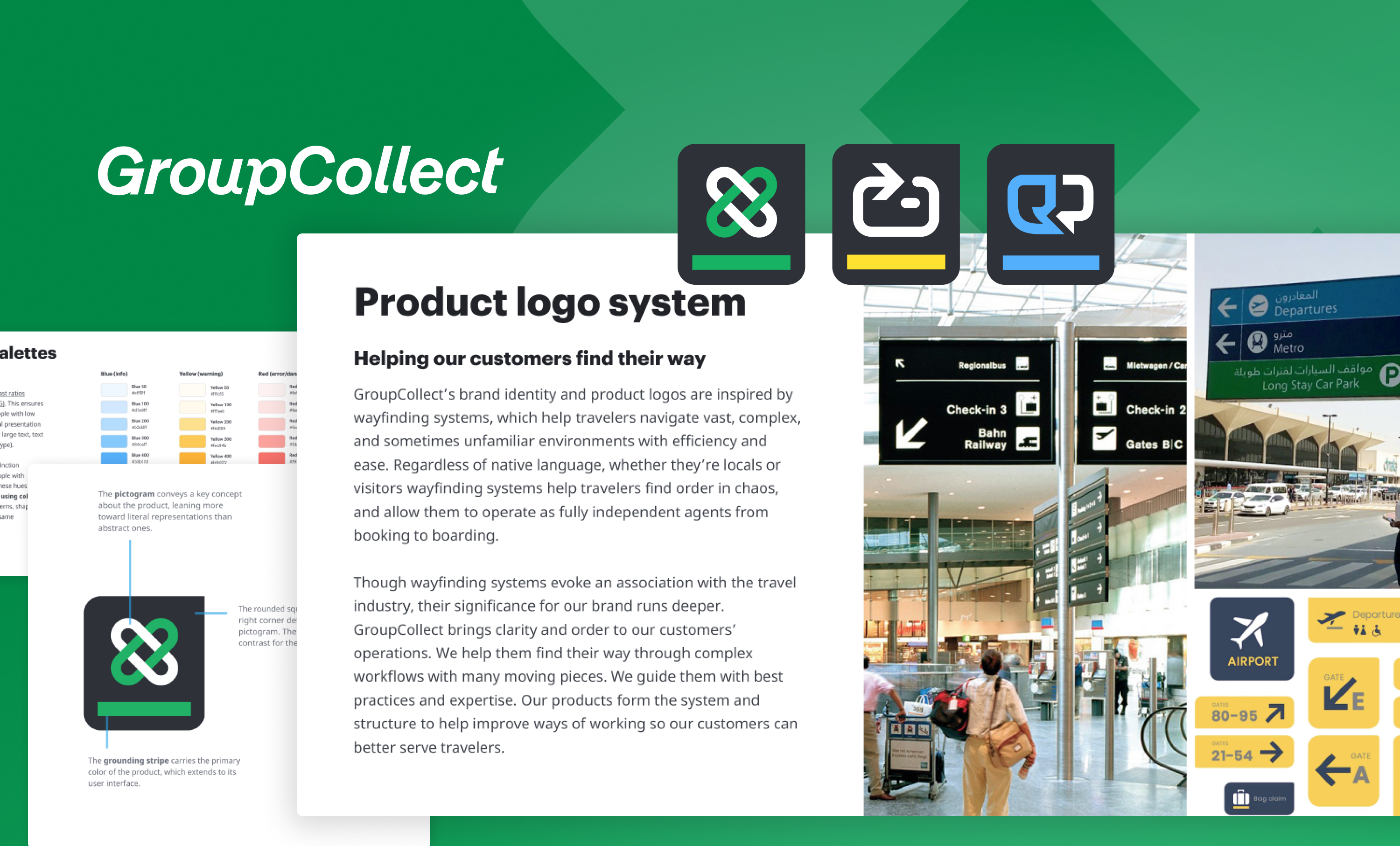
The GroupCollect logotype appears next to 3 logomarks designed for each product in GroupCollect's suite of applications. Below logos, several pages from the brand guidelines show guidance for the product logo system, an accessible color palette, and guidance on creating product logomarks.

Visuals / GroupCollect

Branding refresh for a suite of applications

GroupCollect built success, trust, and name recognition with a registration and payment platform for group travel. They wanted to leverage their well-known name, but the challenge of extending “GroupCollect” to several new products required a rename of their best known app “GroupCollect” to “GroupCollect Register.” We refreshed, expanded, and built upon their strong brand equity to create a new logo system for a growing suite of applications.
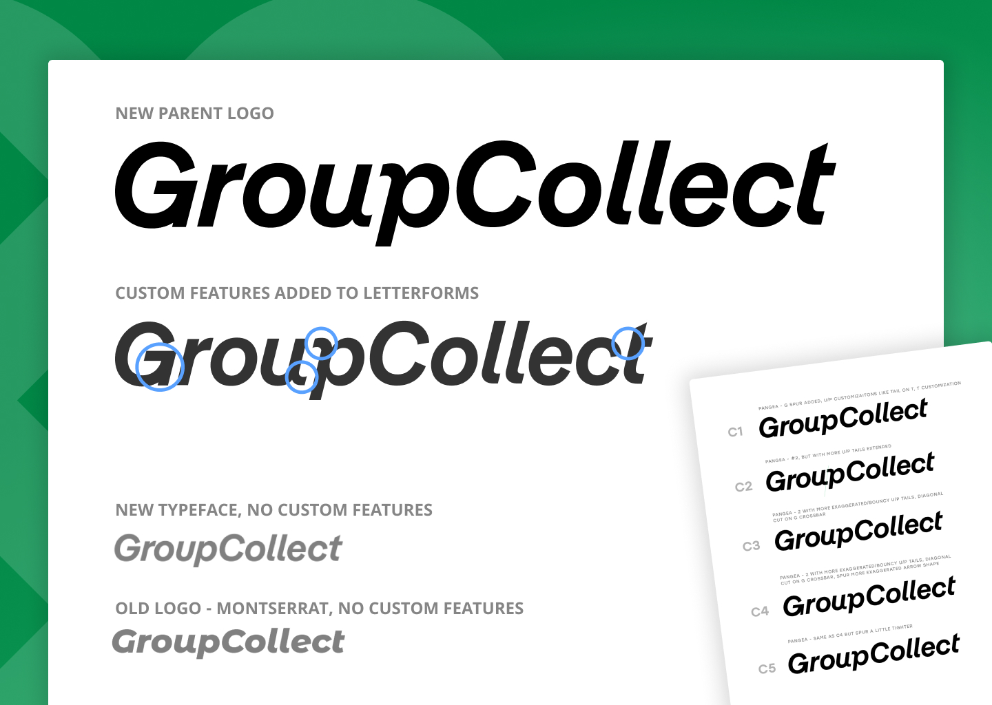
  • The new GroupCollect parent brand logo appears in black at the top. On the next row the same logo shows with blue circles around certain features of the letterforms that were customized, along with other iterations and design experimentation for the parent logo.

    Refresh, not rebrand

    We shifted away from Montserrat (the third most popular Google font) for more open letterforms, improved legibility, and a more custom feel. We kept recognizable features and customized others—a mirrored curl in the “u” and “p,” a simplified “t” crossbar, and an arrow shape in the spur of the “G.”
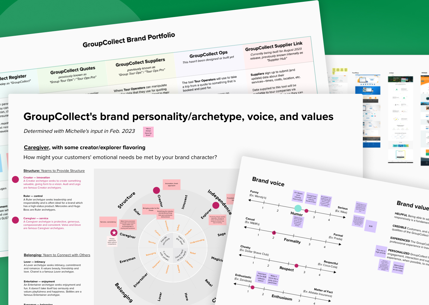
    Competitor analysis, brand personality/archetype, voice and values, and brand portfolio analysis exercises.

    Analysis of competitor positioning and brand archetype exploration to inform branding and identity work.

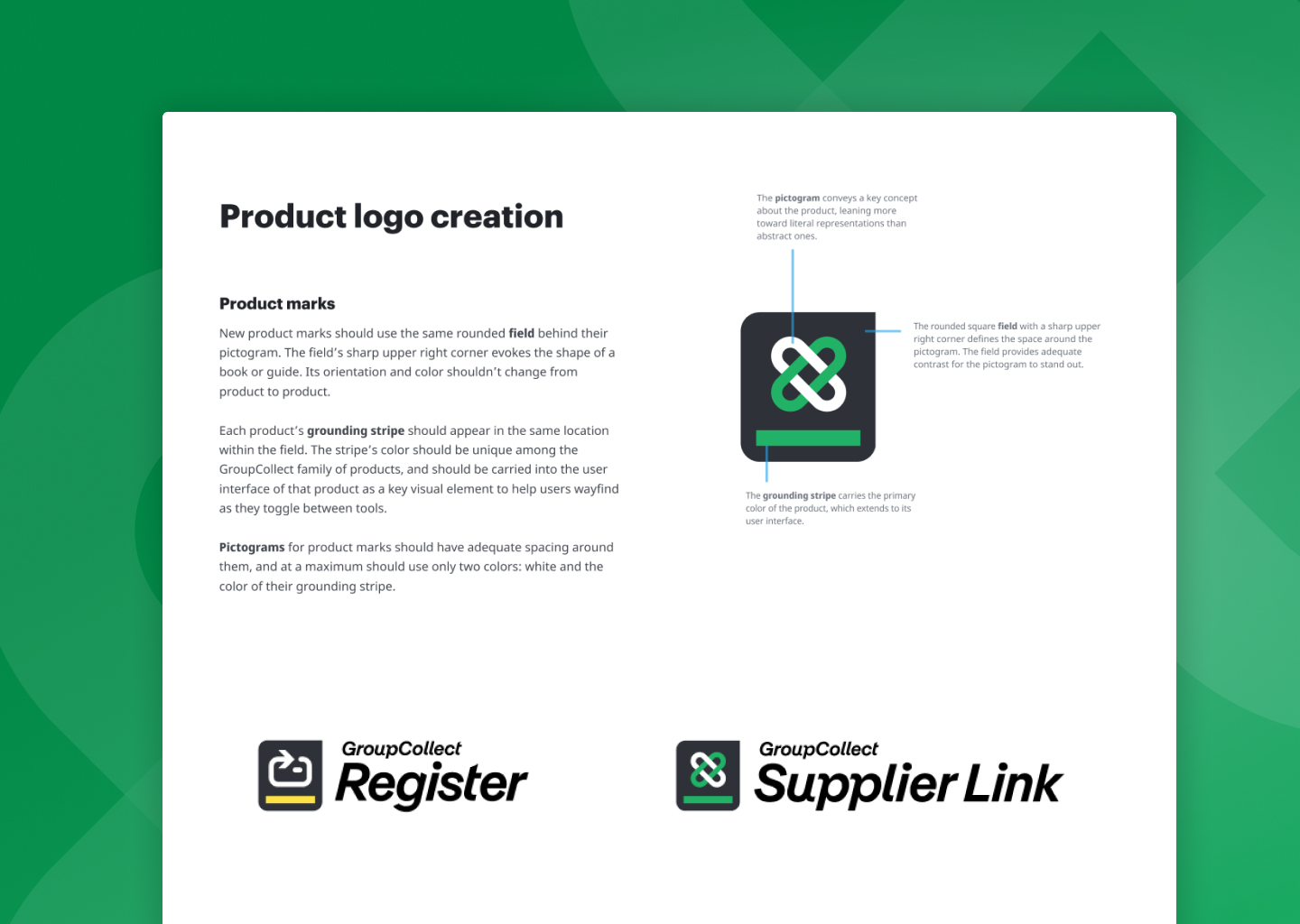
  • The "Product Logo Creation" page of the brand guide shows the design elements that make up a logomark for a GroupCollect product—the gray field (a book-like background shape), the grounding stripe in a vibrant color, and the pictogram.

    Logo system for a growing suite of products

    We helped GroupCollect explore product names and define how each application offers something distinct. We aligned visual strategy across products and designed a logo system that can be leveraged by more applications in the future.
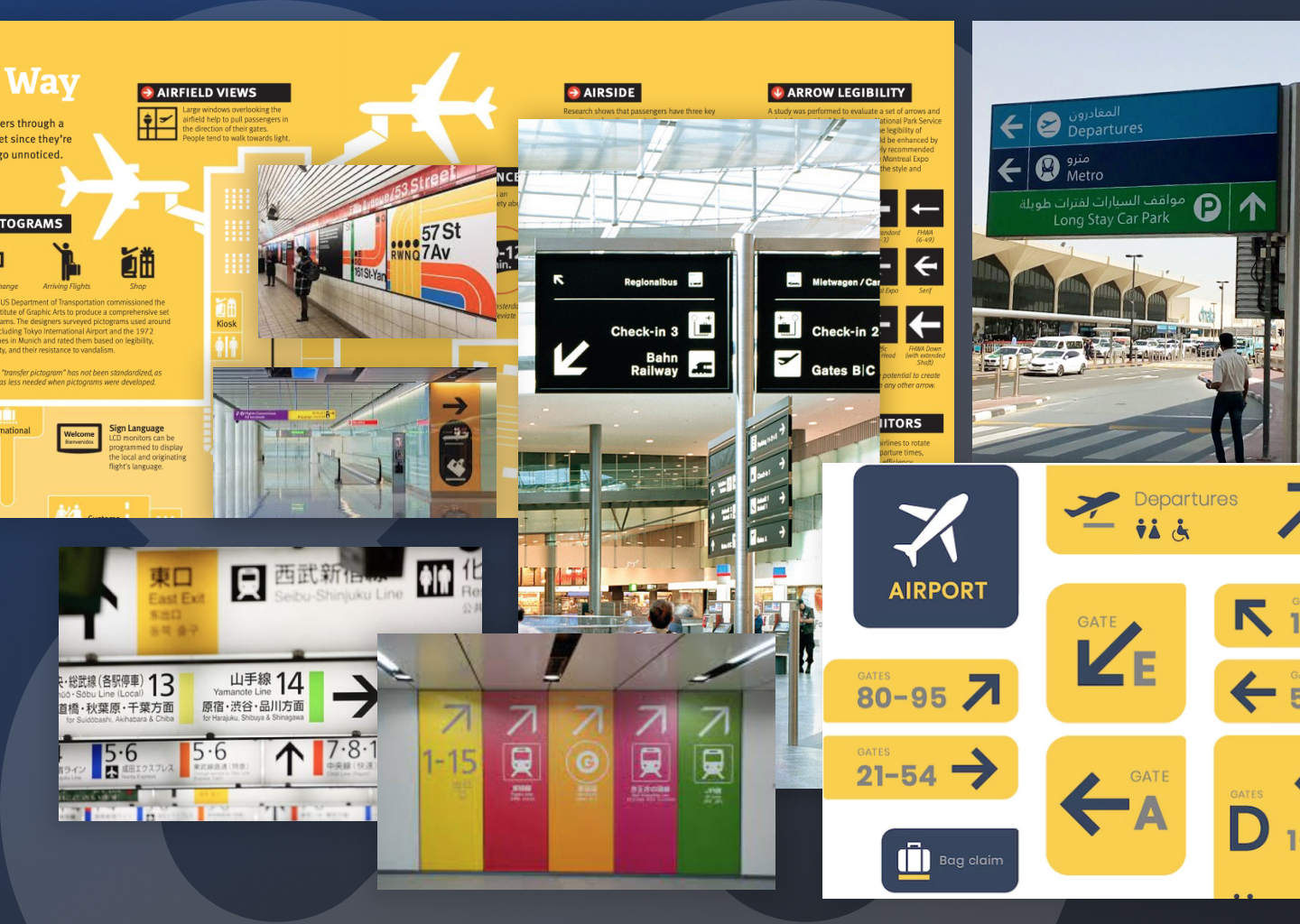
    Mood board and inspiration images showing wayfinding signage displayed for travelers in airports, along roads, and in train stations.

    Mood boards and inspiration from wayfinding systems which help travelers navigate vast, complex, and unfamiliar environments with ease.

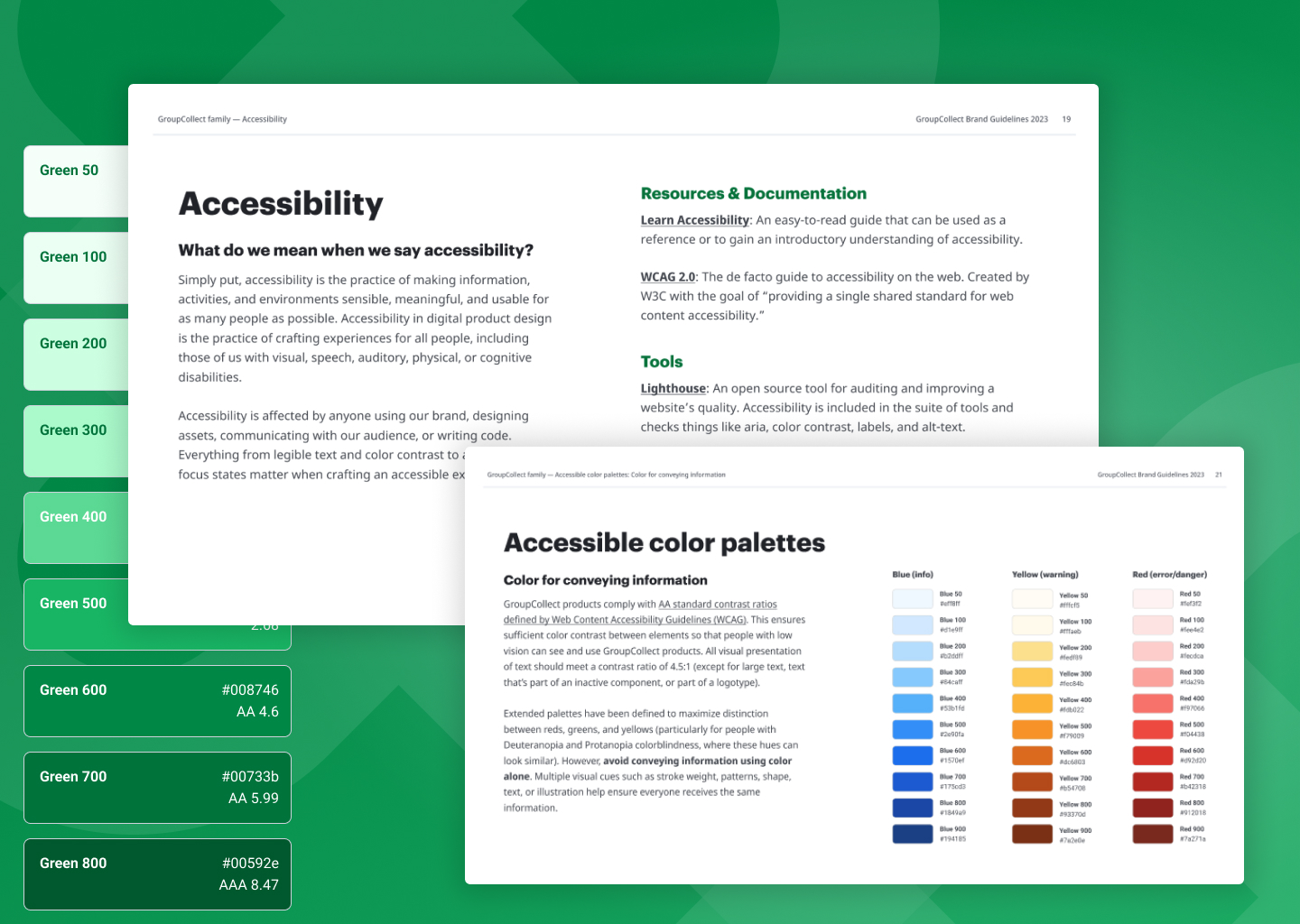
  • Pages from GroupCollect's brand guidelines on accessibility tools, accessible color palettes, with a 9-swatch green color palette that appears behind them.

    Improved accessibility

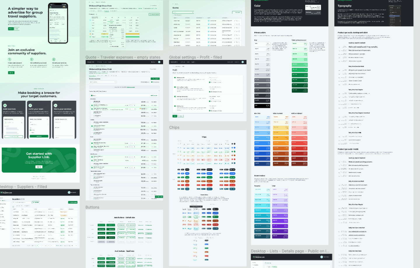
    We shifted colors to maximize red/green/yellow distinction. We built a design system to ensure GroupCollect’s products adhere to WCAG 2.0 AA standard contrast ratios. We built a design system to iteratively roll out branding changes without compromising new feature development.
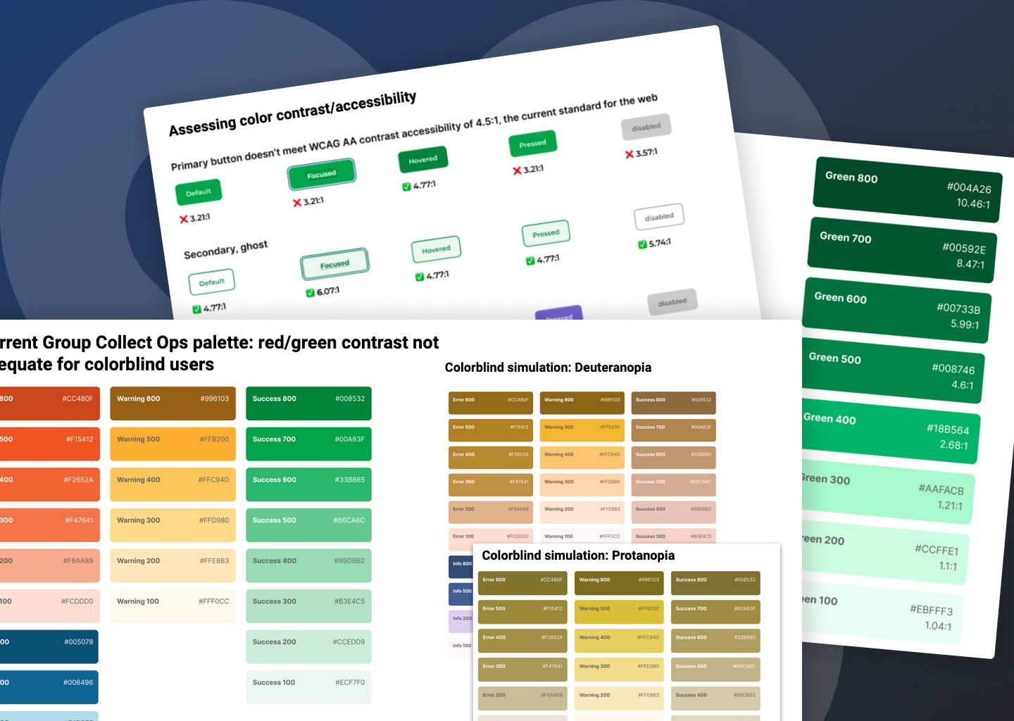
    GroupCollect's old button styles are displayed with red Xs indicating that they fail contrast checks for accessible contrast ratios. Layered in front are several extended color palettes for GroupCollect's old colors. They appear in a simulator for color blindness, revealing that the red, green, and yellow palettes look nearly identical in the Deuteranopia and Protanopia simulators.

    A color audit revealed color combos that did not pass contrast requirements, even for commonly used components like buttons.